
Case study · Nonprofits · California
A California economic development nonprofit website built around its mission.
The problem
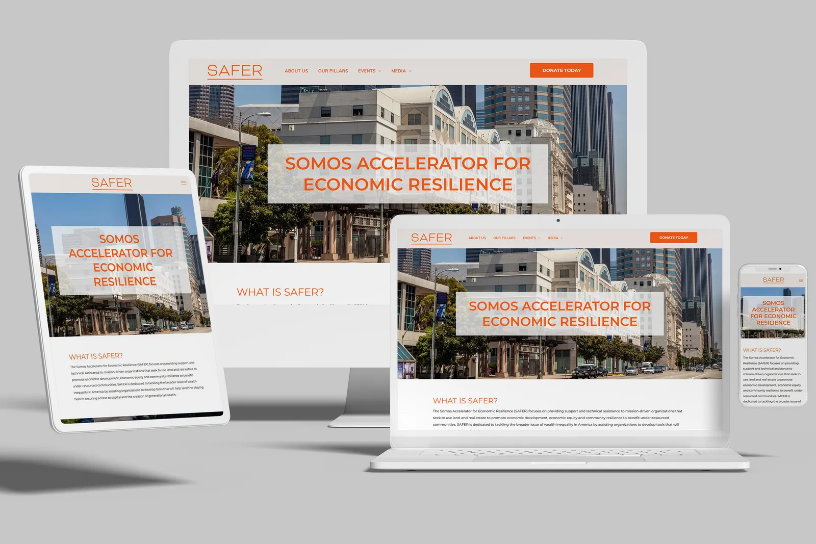
A nonprofit that helps mission-driven groups use land and real estate for community development needed to state its mission clearly and guide visitors to get involved or donate.
What we built
A redesign with a simple, less-is-more layout, a soft cream and orange palette, and calls to action for learning more, getting involved and donating placed throughout.
Quick answers
How should a nonprofit website guide visitors to donate?
State the mission in plain words near the top, then repeat a small set of calls to action such as learn more, get involved and donate. A simple layout keeps those actions from competing with clutter.
When did it launch?
December 2025.