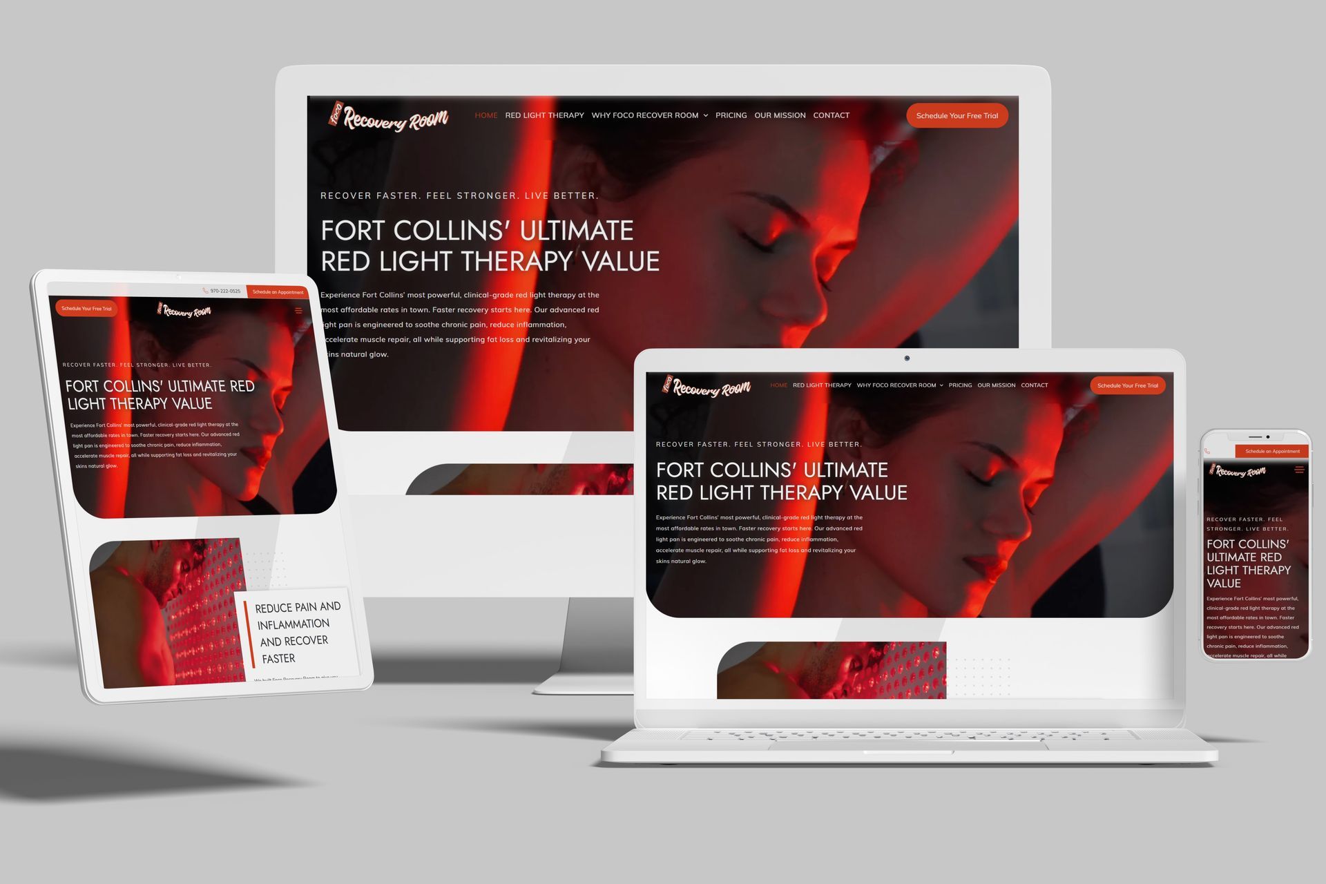
A New Red Light Therapy Website for Fort Collins: Foco Recovery Room
There's a certain kind of project the Fix8 Media team loves. A business doing real, hands-on good for its community, with a service people genuinely rave about, that just needs an online presence to match the experience in the room. That was Foco Red Light Recovery Room in Fort Collins, Colorado.
Red light therapy is one of the fastest-growing corners of wellness right now, and most studios treat it like a luxury spa add-on with the price tag to go with it. Foco's whole approach is different. Clinical-grade power, the most affordable rates in town, and a calm, zen-like space built for actual recovery. The website had to land all of that in about five seconds: powerful, affordable, and genuinely relaxing, all at once.
So we got to work.
A Fort Collins Red Light Therapy Studio That Needed to Stand Out
Foco serves a wide range of people, from elite athletes chasing faster recovery to active seniors who just want to move without pain. The mission is simple and specific: help people live pain-free and perform at their peak through the natural, restorative power of the best red light therapy panels on the market, at a price that does not gatekeep wellness.
That clarity gave us a strong foundation. Every design and content decision came back to three promises the brand makes: it is powerful, it is affordable, and it feels good to be there. The site needed to prove all three quickly, because a first-time visitor comparing options in Fort Collins decides fast whether to book.
Setting the Vibe: Hero Video, Imagery, and Atmosphere
The homepage opens with a full-width background video and the line "Recover Faster. Feel Stronger. Live Better." Motion does the heavy lifting here. It pulls visitors into the experience and the space without slowing the page down or getting in the way of navigation.
From there, the imagery carries the story. We leaned on clean, product-forward shots of the Rouge Ultimate G4 panels and the warm glow they throw off, paired with calm photography of the private zen rooms and the comfortable beds. That combination matters, because Foco is selling two things at once: serious technology and a serious sense of calm. The photography sells the atmosphere as much as the hardware, so a visitor can almost feel what a session is like before they ever walk in.
Color and Mood: Designed Around the Red Light Glow
The palette was built around the one thing that defines this service, the warm red and near-infrared glow of the panels themselves. We grounded that glow with calm, deep, neutral tones so it stands out and the rooms read as restful rather than clinical.
The result is a look that feels premium but warm, advanced but never cold. Generous spacing keeps the layout uncluttered and lets the eye rest, which reinforces the whole promise of the brand. This is a place you go to slow down and recover, and the site should feel that way too.
Website Built to Educate and Build Trust
Red light therapy is still new to a lot of people, so trust matters. We gave the site room to teach. The "What is Red Light Therapy?" and "How Does It Work?" sections explain the science in plain language, from how the light reaches the mitochondria in your cells to how it supports circulation and helps reduce inflammation, along with the reassurance that there are no UV rays and no documented side effects when used properly.
We backed that up with social proof through a rotating set of real customer testimonials, a free downloadable wellness guide to capture leads who are not quite ready to book, and clear callouts of the elite Rouge Ultimate G4 technology as a trust signal.
From Browsing to Booking a Free Trial
A beautiful site that does not convert is just decoration. We kept a clear, repeated "Schedule Your Free Trial" call to action throughout the page, with booking built right into the site so there is no friction between curiosity and a confirmed appointment. Leading with a free trial lowers the barrier even further, which is exactly the right move for a service people want to try before they commit.
Mobile-First, Built for Busy People
Most of Foco's visitors are checking the site on their phone, often right after a workout or while squeezing it into a busy day. Every page and section was built to load fast and work beautifully on any screen, so booking a session from a parking lot is just as easy as it would be on a desktop.
The Result
What we ended up with is a website that matches the experience Foco delivers in person. It is fast, it is calming, and it is built to convert. It communicates clinical-grade power and genuine affordability in the same breath, and its structure helps each visitor find their specific concern, whether that is inflammation, sleep, mental health and mood support, or athletic recovery, and book a free trial in a couple of taps.
Foco Red Light Recovery Room was already doing great work for the Fort Collins community. Now the website finally shows it.
If your wellness studio, clinic, or small business is doing great work with a website that does not show it, we would love to talk.
Reach out to the Fix8 Media’s expert website design and development team.